
For anyone who’s spent time behind a camera, you’ve likely encountered countless “rules” in photography that seem to resurface endlessly—many of which don’t hold up under scrutiny. One of the most persistent myths in food photography is the idea that you should never use the color blue.
Where Did This Rule Come From?
This notion appears to have originated in the 1970s, an era when food stylists were often known as Home Economists. Food photography during that period was, let’s just say, not exactly inspiring. Poorly lit, uninspired images became the standard, and rules like avoiding blue in food shots somehow became entrenched.
Over time, this belief intertwined with discussions on color psychology. Many sources on restaurant branding and food packaging claim that blue is one of the most unappetizing colors, arguing that it can subconsciously discourage people from eating. The rationale is that blue is rarely found in natural foods—beyond blueberries—and therefore might act as an appetite suppressant.
However, such sweeping generalizations are misleading. Making a blanket statement that blue is universally “bad” for food photography oversimplifies a far more nuanced subject.
Testing the Myth
In my food photography community on Facebook, one member recently shared that she had been told never to use blue in her shots. To challenge this, we ran a fun experiment: members shared their food images featuring various shades of blue. The result? Over 110 submissions—all vibrant, visually appealing, and perfectly suited to the foods depicted.
This experiment underscores the main principle of using color in photography: a color should enhance and complement the subject, not be avoided outright. Blue, when used thoughtfully, can elevate a composition and highlight the natural appeal of the food.
Why Blue Works
The secret lies in color theory. Blue is naturally complementary to many warm tones found in food, particularly yellows, golds, and oranges. These colors sit opposite blue on the color wheel, which explains why blue backgrounds, bowls, and props often make foods like citrus fruits, peaches, and leafy greens pop visually.
Consider some examples:
- A turquoise bowl holding bright tangerines creates a striking visual contrast. Orange and turquoise are opposite each other on the color wheel, producing a balanced, eye-catching effect. Greens, which are analogous to blue, further enhance the harmony in this composition.
- Deep red cherries on a rich blue tabletop illustrate another concept: contrast in value. While red and blue are primary colors rather than complementary, the darkness of the blue surface makes the cherries appear even more vivid. The interplay of light and dark tones allows the colors to stand out beautifully, even without strict adherence to complementary color theory.
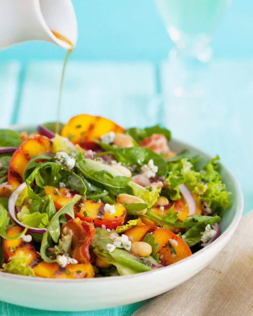
- A grilled peach salad displayed on a blue surface demonstrates the use of analogous colors. Blue and green sit next to each other on the color wheel, producing a soothing, cohesive feel. The golden peaches provide complementary contrast, enhancing the overall appeal without overwhelming the viewer.
These examples prove that there isn’t a single “wrong” way to use blue. Instead, success comes from evaluating the food’s colors and experimenting with different shades, lighting, and background combinations to achieve the desired visual effect.
Conclusion
The myth that blue should never appear in food photography is outdated and unfounded. While color psychology and traditional rules offer guidance, they are not absolutes. Photographers should approach color selection creatively, considering both complementary and analogous relationships, contrast in light and value, and the overall composition.
Blue, far from being an appetite suppressant, can be a powerful tool when used thoughtfully. From bold, deep hues to soft pastels, blue has the potential to enhance the beauty of a wide range of foods, making them appear fresh, vibrant, and irresistible.
Ultimately, food photography is an art, not a rulebook. Don’t let outdated myths dictate your creativity—experiment, trust your eye, and embrace the full spectrum of possibilities, including the often-maligned but remarkably versatile color blue.

